ShopDreamUp AI ArtDreamUp

Deviation Actions


Suggested Deviants


Suggested Collections


You Might Like…


Description
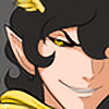
A commission I did for Risth of her RP character Yamamoto Kikue.
I've been messing around with going for a painted look instead of a CG/cel look. This is another of my attempts. >__>; I'm not sure. I'm not completely happy with how it turned out. Critiques would be nice and any helpful suggestions on how to improve would be really nice.
Art (c) Desna 2006
Character (c) Risth
Image size
500x500px 118.79 KB
© 2006 - 2024 desna
Comments4
Join the community to add your comment. Already a deviant? Log In
I think the lighting seems a bit inconsistent. On the sleeve of the arm witht he fan, the lighting looks like it's coming from above, whereare on the torso and the other arm, the lighting seems to be coming form the front. If you pick a light source, and maybe even make it stronger, and just stick with it and make it consistent, it helps hold the whole image together. Also, painted doesn't necessarily mean soft-colored. If anything, painting can lead to stronger divisions of light and darkness. The pose of the figure is nice, and I like your style, just try some stronger lighting. Give yourself real areas of highlight and shadow.
One thing about shadows, one of my favorite things about shadows, is that the closer the shadow is to the object casting the shadow, the sharper the edge. Seriously, just hold your hand over your computer desk, notice how the closer your hand is to the desk, the more defined the shadow it casts, and the further away, the more diffuse? You can apply that here, to the shadow the sleeve casts on the torso, and the shadow of the fan as well.
Don't be afraid to kick up the contrast a notch. (Smile)") You're got a very appealing style, nice anatomy and proportions, good level of detail, you're totally capable of punching up your coloring. And also, while some people will criticize my saying this, don't be afraid of leaving in areas where you can see the brush strokes. Even when you get that row of overlapping circles effect, you don't have to smooth it out. There's no shame in the brushstrokes! They can really increase the painted feel of the piece, like with [link] (and other dangerousllama works).
You're got a very appealing style, nice anatomy and proportions, good level of detail, you're totally capable of punching up your coloring. And also, while some people will criticize my saying this, don't be afraid of leaving in areas where you can see the brush strokes. Even when you get that row of overlapping circles effect, you don't have to smooth it out. There's no shame in the brushstrokes! They can really increase the painted feel of the piece, like with [link] (and other dangerousllama works).
So, I'm totally psyched to see you go for more painting, don't be afraid to really go the whole way. ^^
One thing about shadows, one of my favorite things about shadows, is that the closer the shadow is to the object casting the shadow, the sharper the edge. Seriously, just hold your hand over your computer desk, notice how the closer your hand is to the desk, the more defined the shadow it casts, and the further away, the more diffuse? You can apply that here, to the shadow the sleeve casts on the torso, and the shadow of the fan as well.
Don't be afraid to kick up the contrast a notch.
So, I'm totally psyched to see you go for more painting, don't be afraid to really go the whole way. ^^